
The decisions we make in those first few seconds “above the fold” can mean the difference between a user who clicks and a user who bounces. For digital marketing teams and agencies who want sharper results and less guesswork, understanding how to structure and optimize your hero section is no longer optional—it’s essential for rapid CTR gains.
Why We Fixate on Headlines First
When we look at hundreds of high-performing ad and landing page designs, it’s consistently the headline—not the hero image—that drives the biggest spikes in click-through rate. Why? Because the headline speaks with purpose. In just a few words, it tells users exactly what’s in it for them, creating urgency and clarity in an online environment where attention is scarce.
Most visitors land on a page and decide in seconds if it’s worth their time. If the headline doesn’t answer their core need—speed, cost savings, consistency—they scroll away. This is something we see time and time again when building campaigns for agencies or brands needing results within days, not months. For a deeper dive into performance-first layout strategies, check out our guide on display ad layouts that perform in days.
The Real Role of the Hero Image
Hero images are the brand’s handshake. They convey professionalism, quality, and context—but they don’t drive action directly. Think of your hero image as the supporting cast: it creates the mood and underscores the message, but the headline is what the audience came for. A mismatched image can conflict with your message and create friction, discouraging clicks and conversions.
- Trust is visual. Crisp, relevant images (like product screenshots or real workflow visuals) reinforce your credibility. Avoid generic stock photos, which research shows can lower trust and engagement.
- Guidance is critical. Images that direct the eye toward your CTA or key message (using focal points or gaze direction) result in more interaction.
- Consistency wins. Make sure color, typography, and imagery are in harmony. Inconsistent visuals dilute the brand message—the friction costs you conversions.
Our Go-To Testing Sequence for Lifting CTR—Fast
If you want a concrete roadmap to follow, we recommend prioritizing your hero section testing in a repeatable order. Here’s what works for us at SizeIM, and consistently delivers quick wins for agencies using a data-driven creative workflow.
1. Headline First: Weeks 1-2
- Test strong benefit-driven headlines against feature-based alternatives: for example, “Create All Ad Sizes in Minutes” vs. “Multi-Format Ad Design Tool.”
- Introduce numbers or specific claims—numbers like “15 Ad Sizes in 6 Minutes” speak to measurable value.
- Try urgency signals (“Start Today!”) or strong verbs to see if they move the needle further.
We recommend running each headline variation for at least a week (minimum 1000 visitors). Headline improvements often lift CTR by 15%-25% alone, sometimes more.
2. Layer in a Subheadline: Weeks 3-4
Once you’ve dialed in the main headline, bring in a subheadline to add context without overwhelming the layout. This clarifies who the solution is for, or how it works, or what makes it unique at a glance.
- Specify the audience (“Built for busy agencies”).
- Lay out the big benefits (“Save hours per campaign, keep branding consistent, adapt in real time”).
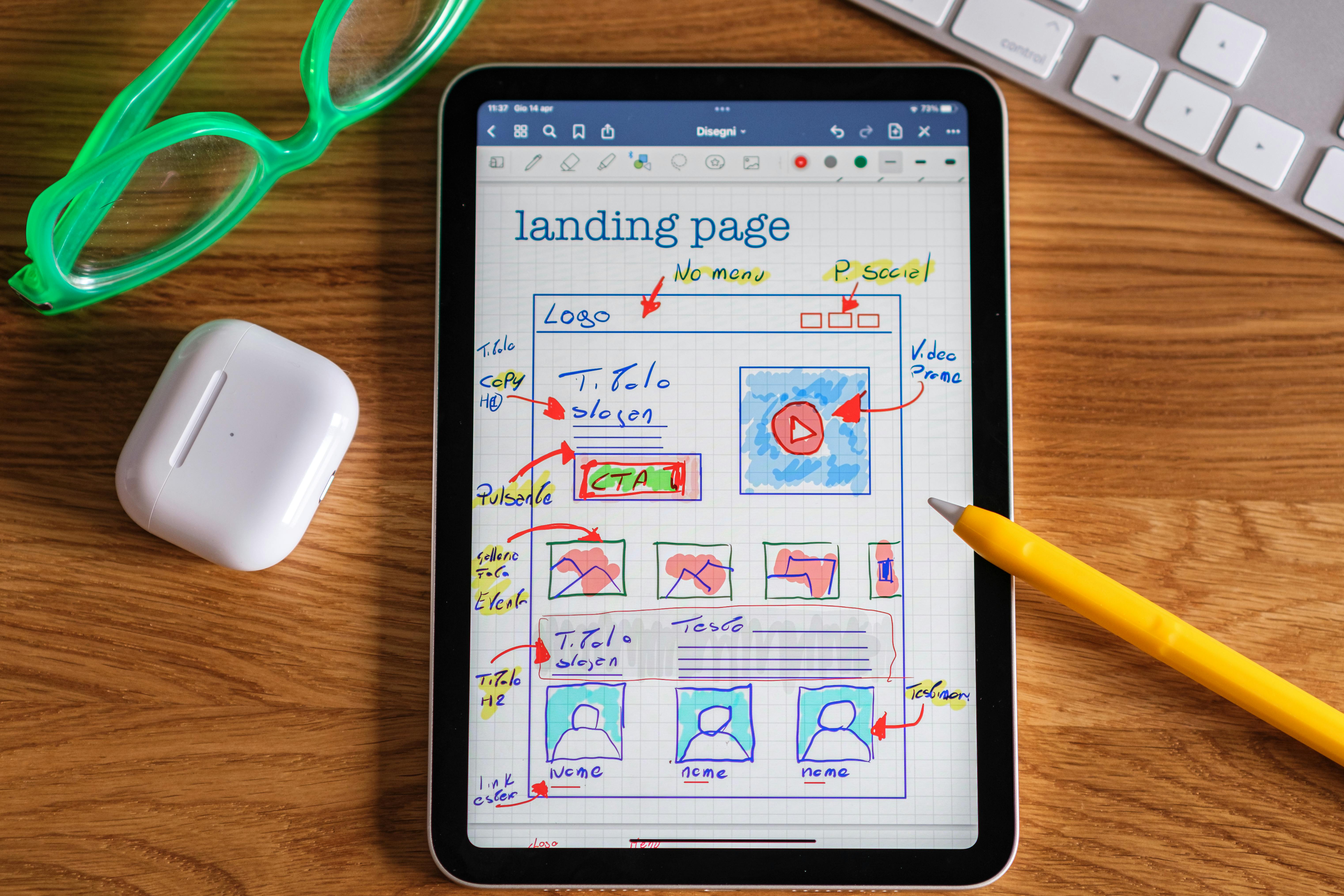
3. Image Alignment: Weeks 5-6
Now update your hero image to support your new narrative. This is where many teams go wrong—testing images without a proven headline as a foundation.
- Compare product-focused images to lifestyle or abstract visuals. Software and B2B campaigns often perform better with clear, relevant screenshots.
- Test images that guide attention toward your CTA rather than away from it.
- Use authentic visuals from your workflow or interface, not generic stock.

4. CTA Copy & Placement: Weeks 7-8
- Test concise, action-oriented button copy (“Start Free Trial” often outperforms “Get Started”).
- Place CTA buttons so they are impossible to miss but not crowded—one primary action above the fold is generally best.
Use real data to select winners. Each element measured separately means you know for sure where the uplift comes from.
Technical Musts for the Modern Hero Section
Beyond creative choices, don’t neglect technical execution. Poor performance isn’t just bad UX—it can tank your search ranking and bounce rates too.
- Compress images. Your hero visuals shouldn’t exceed 150KB.
- Lazy-load secondary visuals. Only headline, subheadline, and CTA need to be visible immediately. Delay everything else for speed.
- Design mobile first. Test your hero section at 320px, 768px, 1920px. Your core message should never get cropped.
- Use descriptive alt text for visuals to boost accessibility and SEO.
How to Measure What’s Really Working
- CTR (Click-Through Rate): Your best proxy for what’s working above the fold.
- Conversion Rate: Are visitors who click through actually signing up, booking demos, or starting a trial?
- Time on Page: Longer average times indicate that your message and visual are connecting.
- Bounce Rate: If people are leaving without scrolling, your first impression isn’t strong enough.
Track these KPIs for each test iteration and keep your test periods long enough (two weeks or at least 1000 unique visitors per variant) for meaningful results.
Common Justifications vs. What Actually Wins
We’ve seen the following mistakes more often than we’d like to admit, all of which can cost you CTR and conversions:
- Testing everything at once (headline, image, CTA)—you’ll never know what really works.
- Relying on placeholder headlines (“Welcome,” “We help you grow”)—these do nothing for your value proposition.
- Using visual-only hero sections without clear copy—trust is built visually, but motivation is built with words.
- Ignoring image compression and mobile cropping—your perfect layout is useless if it loads slowly or appears broken on half your devices.
Why This Sequence Is Critical for Agencies and Teams
If you’re managing creative operations for multiple campaigns, this order is what allows you to get real results, fast. It removes subjective debate (which headline “feels” best?) and replaces it with data-driven improvement. With the right tools, a single headline win can be scaled to hundreds of ad network placements in one click—saving hours and increasing the range of networks you can tackle per campaign.
For teams running frequent creative reviews, you may find our process for a 24-hour creative review sprint equally valuable in speeding up launches without compromising quality.
Our 8-Week Pattern At a Glance
| Weeks | Focus | Impact on CTR | Actions |
|---|---|---|---|
| 1-2 | Headline A/B variants | 15-25% | Test benefit, specificity, urgency, verbs |
| 3-4 | Subheadline clarification | 8-12% | Clarify offer, audience, urgency |
| 5-6 | Hero image (direction/support) | 8-18% | Align visuals to message, test product vs conceptual |
| 7-8 | CTA optimization | 10-22% | Test text, placement, color |
Your Actionable Checklist
- Review your existing hero headline. Does it offer a clear, specific benefit for your audience?
- Draft and test several headline variants—track CTR and conversion separately.
- Only after nailing the headline, add a clear subheadline to provide context.
- Update your hero image to reinforce—not replace—your headline’s narrative.
- Test your CTA button (copy, contrast, position), using single primary actions above the fold.
- Run each test long enough to generate reliable results and avoid false leads.
Conclusion: Headlines Drive Action, Images Close the Deal
We’ve seen firsthand that structured, stepwise testing starting with the headline is the fastest path to a tangible CTR lift. Imagery matters, but only in service of your message. Pairing bold, benefit-first messaging with contextually reinforcing visuals and optimized CTAs gives your campaigns velocity and scale.
If you’re ready to move fast and multiply your returns, explore more of our actionable playbooks, or try building responsive ads at scale with SizeIM. It’s the smarter way to take winning creative and deploy it everywhere, instantly. Learn more at SizeIM.com.