Many display ads immediately communicate a sense of quality, exclusivity, and trust—what most people call an “expensive” feel—long before any price or offer is shown. This is rarely accidental. These ads use specific visual signals proven to influence how viewers perceive a brand’s reliability and desirability, shaping everything from first impressions to click and conversion behavior. Understanding why some ads feel expensive, and how these visual cues build trust, is essential for designers, marketers, and agencies looking to elevate their campaigns and maximize results.
What Makes an Ad Feel Expensive?
A display ad feels expensive when the viewer subconsciously associates its visual elements with luxury, precision, and exclusivity. These feelings are anchored in the use of:
- High-resolution, pristine imagery
- Purposeful negative space and balanced compositions
- Premium, muted color palettes
- Sophisticated and well-executed typography
- Subtle but tangible texture or depth
- Consistent brand cues and minimal visual clutter
Science and practice both show these signals have a tangible impact. They not only elicit emotions like pride, aspiration, and trust, but also subtly affirm to viewers that the brand invests in quality at every touchpoint, including its advertising.
The Psychology: How Expensive Visual Cues Build Trust
Visual signals in advertising don’t just beautify. They trigger emotional responses that override rational analysis and move audiences closer to action. When ads employ cues associated with luxury—like fine detail, restraint, and exceptional clarity—viewers naturally interpret the brand as more trustworthy and professional. Studies confirm that emotional resonance outweighs rational arguments in forming positive attitudes toward ads, particularly in categories where self-identity, social status, or aspirations play a role.
For brands with a reputation for quality, these signals help maintain trust even when introducing new products, sizes, or markets. For newer or challenger brands, deploying “expensive” visual codes can create instant credibility and command attention against more established players.

Definition: Visual Signals of Trust and Expense
Visual signals that evoke expense and trust in advertising are design choices that communicate luxury through perception rather than explicit cost. These elements indicate a brand’s commitment to quality and detail, often aligning with what consumers expect from high-end products or services. They include but are not limited to refined imagery, balanced layouts, selective use of space and color, and consistent branding across all platforms and ad sizes.
7 Visual Elements That Signal Premium Quality
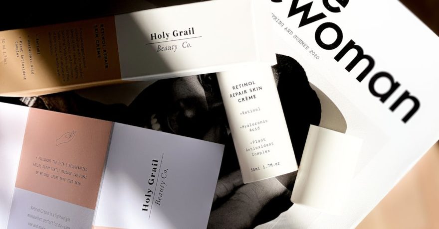
1. Pristine High-Resolution Imagery
High-quality images (300 DPI or better) with excellent lighting and detail signal professionalism and investment. Grainy or poorly cropped visuals instantly undermine trust. Many brands, including leaders in technology and fashion, rely on product shots that highlight texture and craft, making the product feel artisanal and valuable.
2. Balanced, Minimalist Compositions
The intentional use of negative space—often 40–60% of the canvas—lets key elements breathe. Applying rules like the rule of thirds and central alignment helps create a calm and elegant feel, implying thoughtfulness and confidence. Overcrowded layouts or excessive decoration can send the opposite message, signaling mass-market or budget positioning.

3. Premium Color Palettes
Luxury ads favor muted, sophisticated hues (deep navy, gold, ivory, charcoal) rather than loud primaries. Limiting the palette to three or four core colors ensures harmony and brand recall. These palettes communicate restraint, tradition, and care in brand presentation.
4. Sophisticated Typography
Font choice is crucial. Elegant serif fonts or subtle sans-serifs, customized with proper kerning and line height, evoke quality. Overly decorative, amateurish, or generic fonts diminish the perception of expense and reliability. Good typography demonstrates attention to invisible details—just like fine product design.
5. Subtle Texture and Depth
Faint gradients, paper or linen effects, and gentle embossing add tangible cues of craft and tactility. These textures mimic luxury packaging or materials, reinforcing a connection between the viewer and the product’s implied quality.
6. Strategic Use of Scale and Negative Space
Making a single hero object dominant within a sea of white or dark space—think a perfume bottle, designer watch, or sleek automobile—creates an “awe” factor. It’s a signature move in luxury advertising that draws attention and conveys rarity or importance.
7. Consistent Brand Elements
Placement of logos, color choices, and visual motifs should remain consistent across all ad sizes, from mobile banners to billboards. Consistency builds familiarity and fosters the kind of trust that only comes from repeated, predictable brand experiences.
How SizeIM Makes High-Trust, Expensive-Looking Ads Effortless
It’s one thing to design an elegant, trust-building ad for a single format. Scaling that quality across 10, 20, or even more display sizes for various platforms is what separates efficient teams from those caught in endless manual adjustments. This is where SizeIM becomes the indispensable partner for agencies and designers committed to brand integrity and operational excellence.
With SizeIM, you design once and generate all required sizes automatically. Every visual element—imagery, space, color, typography, and branding—is preserved and adapted to each network’s exact specification.
- Instantly resize ads without recreating every layout
- Use Brand Kit Management to ensure logos, colors, and fonts are uniform in every format
- Choose from a curated library of premium templates, already optimized for the visual cues that signal quality
- Assign and manage workflow roles to maintain oversight as campaigns scale
- Access an extensive image library to ensure high-resolution visuals are always close at hand
By automating the most tedious parts of the process, SizeIM lets designers and agencies focus on creativity, not mechanics. This unique capability helps brands maintain “expensive” visual signals—and the trust they inspire—no matter how many ad sizes or networks a campaign requires.
Step-by-Step Framework: Building Trust with Every Ad
- Audit Current Visuals: Walk through existing campaigns, scoring each element—imagery, space, color, typography, texture, scale, brand consistency—on a 1–10 scale. Look for weak links where trust or quality could be higher.
- Pick a High-Quality Template: In SizeIM, select from over 200 templates tailored for sophisticated, luxury-oriented brands.
- Set Up Your Brand Kit: Upload the right logos, color codes, and font files to ensure maximum consistency across all sizes and outputs.
- Add Imagery with Intention: Use only high-resolution photos and visuals that reflect craftsmanship or aspiration. Avoid stock images that don’t meet this standard.
- Lay Out and Fine-Tune: Use negative space generously, refine typography, and leverage subtle effects to add depth without distraction.
- Generate All Sizes: Instantly export your ad set to cover every placement—from small squares to leaderboards—knowing every version blends trust, consistency, and impact.

Best Practices: Creating Expensive-Looking, Trusted Ads at Scale
- Prioritize clarity over clutter: Every element must earn its spot; remove unnecessary details.
- Be intentional with color and typography: Consistency across all platforms reinforces trust and premium value.
- Stay true to your brand guidelines: Even slight deviations can erode reliability and perception of professionalism.
- Test different levels of restraint: Sometimes reducing rather than adding is the trick to achieving a luxury feel.
- Leverage automation judiciously: Tools like SizeIM allow you to adopt premium design practices at scale, preserving quality throughout high-volume campaigns.
- Iterate with feedback: Gather reactions from real users and internal stakeholders to refine your cues and ensure messages of trust and quality are landing as intended.
For additional strategies on micro-design moves that impact click-through rates, see our guide: Cognitive Shortcuts in Ads: 8 Micro-Design Moves That Lift CTR.
SizeIM in Action: Adapting for Every Size, Every Campaign
Designing for a single luxury format is one hurdle. Syncing that perception of trust and expense across dozens of required digital display sizes is a task that historically has eaten up agency man-hours and created headaches over inconsistent branding. SizeIM is purpose-built to solve this problem. Our platform automates the resizing workflow, allowing creative teams to deliver premium, polished visual experiences in every network-specific dimension, all while ensuring that core visual signals—the ones that drive trust—remain uncompromised.
This not only protects your brand’s reputation for quality but delivers substantial cost and time efficiencies, freeing creative resources to focus on campaign strategy and big-picture messaging.
Frequently Asked Questions
What makes an ad appear trustworthy versus cheap?
Trustworthy ads use high-resolution imagery, disciplined use of color and negative space, and consistent branding. Cheap ads typically suffer from pixelation, cluttered layouts, inconsistent fonts, or garish colors that signal inattention to detail. The perception of trust and expense is rooted in adherence to refined, purposeful design choices.
Why do consistent brand elements matter so much in digital ads?
Consistency in logos, colors, fonts, and layout across all ad formats creates familiarity and reliability. Repetition builds long-term trust by ensuring audiences know exactly what to expect from a brand, regardless of where or how they interact with its advertising.
How can agencies maintain luxury cues across multiple ad sizes?
Agencies can use platforms like SizeIM to automate the resizing process, locking in chosen branding, typography, and color palettes so every ad version retains the original design intent. This eliminates issues like misplaced logos, stretched images, or altered spacing between formats.
What are common pitfalls when aiming for an ‘expensive’ look?
Common mistakes include using low-res images, overcomplicating layouts, mixing fonts or palettes without intention, and sacrificing negative space for unnecessary information. Many businesses find that erring on the side of restraint, and obsessing over consistency, yields better perceptions of trust and quality.
Are expensive-feeling ads just for luxury brands?
No. Any brand or campaign can benefit from signals that convey professionalism and care. Expensive-feeling ads simply harness proven design codes to elevate brand perception and trust, regardless of category or audience.
How does SizeIM save time and resources for design teams?
SizeIM lets you create one design and instantly generate every required size for digital display, using automated Brand Kit Management to keep every element consistent. This approach eliminates manual tweaking, reduces risk of error, and accelerates speed to market, freeing up design teams for higher-value creative work. For more detail, visit our blog on tools that instantly resize one ad for every network.
Conclusion
The visual signals that make an ad feel expensive and trustworthy are the product of careful, strategic design—not high budgets alone. These cues—including top-tier imagery, purposeful composition, refined color and type, and flawless consistency—work together to signal brand quality before a single word is read. For design-forward marketers and agencies, maintaining these standards across every platform and campaign is the new minimum for building audience trust.
With automation tools like SizeIM, teams can implement these best practices at scale, preserving every pixel and nuance that contributes to a premium, trusted image—no matter how many ad sizes, brands, or networks are in the mix. Book a demo or start your free trial to see how quickly your team can broadcast the unmistakable look of trust and quality in every ad.