The digital advertising landscape is now more diverse—and more fragmented—than ever. As businesses look to launch scalable display ad campaigns that deliver consistent impact across screens, the age-old debate of responsive vs. adaptive design returns to the spotlight. If you’re in digital marketing or ad design, making the right choice can dramatically impact your workflow efficiency, brand consistency, campaign performance, and ultimately, your ROI.
Understanding the Approaches: Responsive vs. Adaptive in Display Ad Design
Let’s lay the groundwork. Both responsive and adaptive design solve for the same pain: how can we make a single ad creative look stunning and effective on any screen, from a smartphone’s leaderboard to a giant desktop billboard? What sets them apart is how they achieve this adaptability.
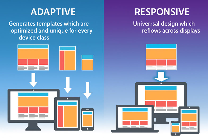
Responsive Design
Fluid, single-template approach: A single design layout reorganizes itself seamlessly using CSS and flexible grids based on the screen’s available space.
Automatic resizing: Elements scale, stack, or shift to fit; there are no fixed breakpoints tied to specific devices.
Pros: Fast to implement, needs only one template, ensures long-term compatibility with new devices.
Cons: Design control is less granular, so elements may not always look pixel-perfect at every odd size.
Adaptive Design
Fixed, multiple-layout approach: Several distinct layouts are custom-designed for specific screen sizes or device types (like mobile, tablet, laptop, desktop).
Server or client detection: Chooses which design to serve based on the device’s capabilities and screen size.
Pros: Precise design control, allows for device-specific features, can serve highly optimized assets for speed.
Cons: Time-consuming to create, labor-intensive to maintain as the number of device variants grows.
Why Display Ad Networks Raise the Stakes
Unlike website interfaces, display ads must comply with a mind-boggling array of format standards. Agencies and brands face an operational nightmare: dozens of ad networks (Google, Facebook, LinkedIn, programmatic exchanges, and more) each with their own preferred sizes, file requirements, and user contexts.
Here’s the kicker: the cost and complexity of manually resizing, reformatting, and testing your ad creatives multiplies exponentially with every new channel you add.
Evaluating Scalability: Workflow, Consistency, and Cost
Responsive Design: The Scalability Powerhouse
Design once, deliver everywhere: Responsive approaches cut the busywork for designers by allowing a single ad asset to instantly adapt to countless size and aspect ratio demands.
Centralized brand control: Since all sizes come from one layout, branding (fonts, colors, logos) stays uniform, maintaining brand integrity system-wide.
Future-proof your ads: No need to chase after the latest device or social media canvas. Responsive layouts flex for what’s next.
Lower long-term costs: One editable master file means fewer hours spent on asset production, less margin for error, and easier updates across the whole set.
Adaptive Design: Precision, But at a Price
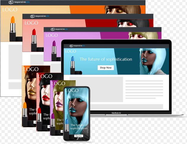
Tailored user experiences: Adaptive ads enable hyper-specific creative solutions. Think: interactive banners built for desktop, super-fast video on mobile, or custom CTAs depending on device hardware capabilities.
Speed and control for flagship formats: If you have a high-visibility homepage takeover or an interactive rich media ad, adaptive’s pixel-perfect control is invaluable.
Operational challenge: If your campaign spans dozens of networks and formats, recreating each variant can bloat design timelines and budgets.
Ad Performance Across Devices and Networks
Loading Speed and Asset Optimization
Adaptive: Can serve optimized lightweight assets for each device, potentially boosting mobile load times and engagement.
Responsive: Loads a master asset and scales it down as needed—this simplicity means universal compatibility, but may result in larger asset sizes on smaller devices if not carefully managed.
User Experience and Brand Consistency
Responsive’s sweet spot: For campaigns focused on blanket reach, CPM, and systemic efficiency, responsive keeps everything beautifully unified.
Adaptive’s wow factor: When you want bespoke design flourishes or advanced interactivity that maximizes ROI for hero campaigns, adaptive gives you the control you crave.
Our Unique Perspective: Why a Responsive Core With Adaptive Enhancements Wins
At SizeIM, we’ve seen every type of campaign, from scrappy startups running a few banner ads, to agencies handling hundreds of brand kits and thousands of creative variations. Our experience has taught us that agility is everything.
If your goal is to scale quickly and manage dozens or hundreds of display ad variations with minimal overhead, responsive is an absolute game changer. Our clients save hours (and often days) on every campaign by embracing a design-once, deploy-everywhere responsive mindset.
Brand safety and consistency become effortless. With all assets tied to a unified brand kit, we help clients eliminate embarrassing inconsistencies and maximize trusted impressions across ad networks.
But—when our partners want a hero ad to really sing or have network-specific requirements where interactivity and device-special features matter, pairing our responsive core with a few adaptive layouts makes the most strategic sense.
Examples from Real Agency Experiences
Scenario 1: A digital agency serves multiple clients with variable budgets. With responsive ad generation, designers can focus on storytelling and creative ideas, trusting the system to output production-ready assets for every placement in minutes.
Scenario 2: For a global brand’s launch event, a few core sessions are designed adaptively for signature spots—such as animated HD billboards or interactive mobile-only experiences—but the vast majority use our responsive system, guaranteeing global reach at a fraction of the former time and cost.
Making the Choice: A Practical Comparison Table
Factor
Responsive Design
Adaptive Design
Setup Time
Quick; one template adapts to all
Slower; several templates needed
Design Control
Automated, less pixel-specific
Pixel-perfect; each variant custom
Maintenance
Low; update once applies everywhere
High; changes require re-editing all
Scalability
Easily handles many formats/networks
Practical for a handful of key placements
Brand Consistency
Effortless; one master style system
Possible, but much more complex
Best For
Agile, large-scale ad campaigns
Flagship, high-impact hero ads
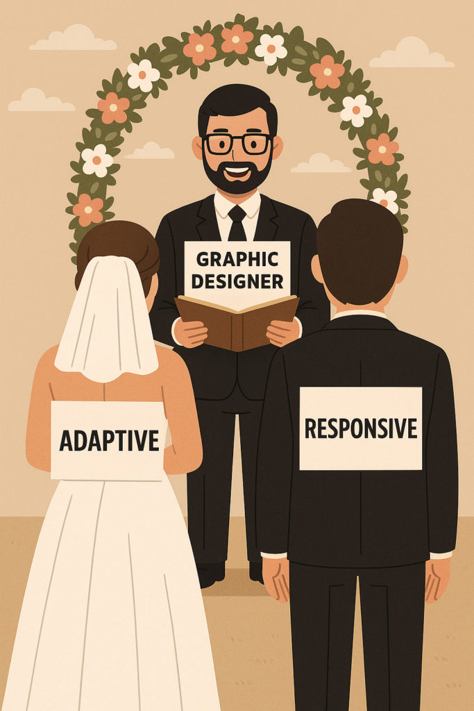
Hybrid Strategies: When to Blend Both Approaches
Here’s our takeaway: You don’t have to choose one over the other in every case. Most forward-thinking agencies and brands rely on a responsive core (for broad scale and reach) and sprinkle in adaptive techniques (for high-investment, marquee campaign placements)—the best of both worlds.
Automated, responsive ad sets take care of the long tail of standard placements.
Adaptive customizations ensure flagship ads or interactive elements feel exclusive and premium where it matters most.
How SizeIM Makes Responsive Display Ad Production Effortless
If you’re an agency or brand trying to unlock these scalability and consistency wins the smart way, check out how SizeIM’s platform lets you design once and automatically generate ad sets in every format required—no more manual rework, and always on-brand. Our editor, brand kit management, and automated responsive resizing mean your creative direction genuinely scales, letting you spend more time on strategy and less time wrangling formats.
Your team can test drive our platform for free and see firsthand the difference a modern, flexible, and scalable ad design solution makes.
In Summary
Responsive design is your go-to for scaling up efficiently across dozens or hundreds of networks. It preserves creative intent, accelerates workflows, and eliminates repetitive asset handling.
Adaptive design shines for bespoke, interactive, or high-profile placements where design perfection and user/device specificity are crucial.
Mixing both approaches gives you “big brand” performance and “startup” agility, no matter your team size or campaign target.
Ready to rethink your display ad workflow for the modern era? Try SizeIM for free today and discover the seamless fusion of responsive and adaptive ad design at scale.
Elevate your advertising game with SizeIM’s cutting-edge ad design automation platform. Our innovative tools empower businesses to effortlessly customize, automate, and amplify their ad production and delivery processes.
Say goodbye to manual labor and hello to streamlined efficiency as you scale up your advertising efforts with SizeIM.
We use cookies on our website to customise your experience and analyse our traffic. To learn more about how we
use cookies, please see our privacy policy.
 The digital advertising landscape is now more diverse—and more fragmented—than ever. As businesses look to launch scalable display ad campaigns that deliver consistent impact across screens, the age-old debate of responsive vs. adaptive design returns to the spotlight. If you’re in digital marketing or ad design, making the right choice can dramatically impact your workflow efficiency, brand consistency, campaign performance, and ultimately, your ROI.
