Expressive typography is often the secret ingredient behind truly brilliant display ads. When executed well, it catapults campaigns above the noise, sharpening brand identity and streamlining communication. However, push expressive typography too far, and your ads can quickly become unreadable, confusing, or simply ignored. So, how can design teams and agencies ensure typography actually boosts ad clarity rather than undermining it? As experts in digital ad production at SizeIM, we see firsthand how the right typographic choices empower brands at every touchpoint — and where things can easily go off the rails.
Let’s dig into exactly when expressive typography helps your display ads grab, guide, and convert audiences — and when it backfires. Along the way, you’ll find actionable guidelines, common pitfalls, recommended fonts, and a proven workflow for ensuring typographical brilliance at any scale.
Definition: What is Expressive Typography in Display Advertising?
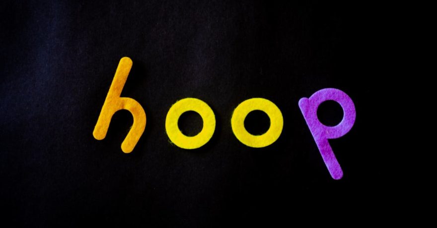
Expressive typography refers to font choices and letter styling that go beyond legibility, aiming to convey personality, energy, and emotion. In display ads, this includes everything from playful decorative fonts and bold sans-serifs to creative use of colors and letter spacing. The end goal is not just to transmit information, but to make the message more compelling, memorable, and brand-aligned.
When Expressive Typography Boosts Clarity
- It establishes clear hierarchy. Strong typographic variation differentiates headlines, subheaders, CTAs, and support text, ensuring key messages pop — even at a glance.
- It connects emotionally. Fonts act as visual inflection, instantly signaling playfulness, confidence, elegance, or innovation — all before any copy is read.
- It increases scannability in crowded spaces. Creative typography draws attention, improving ad visibility over generic or bland type choices.
- It supports consistent brand recall across ad sizes. When your typography is distinctive and carried across formats, brand recognition and trust soar.

How SizeIM Customers Get the Most from Typography
Clients using SizeIM often leverage our automated ad resizing and responsive design features to ensure expressive typographic choices stay clear, crisp, and powerful across twenty or more digital ad sizes. This guarantees that whether an ad appears as a tiny 320×50 mobile leaderboard or a spacious 970×250 billboard, important messages retain impact and hierarchy.
When Expressive Typography Hurts Readability
- Overly ornate or decorative fonts for body text. Large, complex display typefaces can look phenomenal in headlines, but shrink them to body size and the message is lost.
- Insufficient text/background contrast. If contrast dips too low, every word becomes a squinting contest. This is especially risky if ad designs chase trendy color palettes without testing accessibility.
- Excessive use of all-caps. While all-caps headlines can feel commanding, too much all-caps slows reading and kills comprehension, especially in longer text blocks.
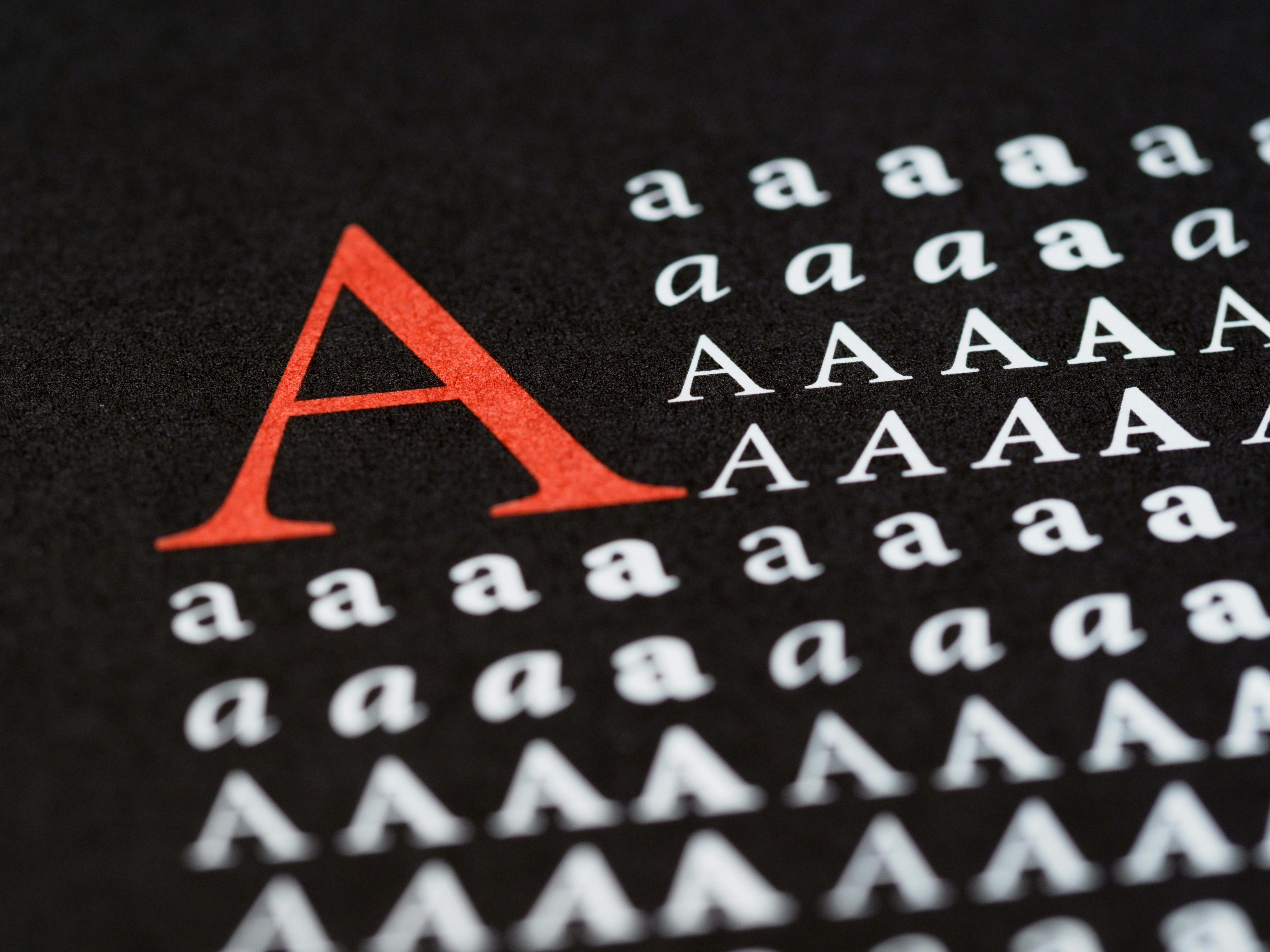
- Poor font pairing. Combining too many fonts or mixing clashing personalities (e.g., playful script with rigid geometric) confuses users and weakens brand cohesion.
- Font choices misaligned with audience or context. A font that exudes energy for a child’s product feels out of place in a luxury finance ad — and vice versa.

Framework: A Five-Step Process for Typographic Excellence
To make sure your expressive typography consistently elevates display ad performance, follow this simple five-point checklist favored by professionals at SizeIM:
- Speed-Read Test: Can all text be comfortably read in 5 seconds? If not, improve legibility, size, or font choice.
- Hierarchy Check: Does the eye naturally land on the most important message? Headline font should dominate, CTA clearly visible, and details receding.
- Audience Alignment: Ask if your chosen font, casing, and styling truly suit your brand’s target demographic and industry norms.
- Cross-Size Consistency: Check that your typography scales and reflows well across all display ad dimensions (especially using platforms like SizeIM for automated adaptation).
- Technical Assurance: Use web-safe or properly embedded fonts, test for correct rendering across devices, and ensure font files don’t slow down ad loading.
Best Practices for Expressive Typography in Display Ads
- Use expressive or decorative fonts only for key headlines or callouts. Keep body text in simple, proven-readable sans-serif or subtle serif options.
- Limit font combinations to 2-3 per ad. One expressive headline font paired with one supporting font is usually enough.
- Maintain strong contrast between text and background. Adhere to accessibility guidelines. If straying from black-on-white, test for clarity at every stage.
- Capitalize for emphasis, not everywhere. Reserve all-caps for extremely short impact words. Avoid it for extended messages.
- Consider cultural relevance and industry expectations. A tech-focused audience may expect modern geometric sans-serifs, while financial brands often require more classic, trustworthy serif choices.
- Automate adaptation with responsive ad design tools. Platforms like SizeIM help maintain typographic intent and clarity as the ad shape or size changes.
Font Recommendations: What Works Best in 2025 and Beyond
- For headlines: Modern sans-serifs like Inter, or bold custom display typefaces aligned with your brand.
- For luxury/editorial tone: Playfair Display or elegant high-contrast serifs.
- For supporting text: Clean, readable system fonts or sans-serifs. Keep style simple and letterforms open.
- For creative edge: Limit playful scripts or decorative fonts to very short callouts, never for body or essential copy.
Common Mistakes and How to Fix Them
- Decorative fonts for long text: Reserve bold type for headlines and switch to accessible fonts for details.
- Poor color contrast: Default to black on white or test for 4.5:1 contrast minimum for accessibility.
- Over-styling: Choose size or weight for emphasis, not both. Too much styling is distracting.
- Ignoring device constraints: Always preview ads at every size and platform where they will appear.
Automation and Consistency: SizeIM’s Advantage
Modern campaigns require display ads in a dizzying array of sizes. Manual resizing leads to inconsistent font application, ruined spacing, or subtle alignment errors that erode brand recognition. SizeIM solves these pain points by letting designers create just one master layout, then generating all the sizes automatically. This means your careful typographic choices always land with clarity, power, and precision — no matter the resolution or platform.
If you often struggle to ensure CTA buttons and brand headlines remain punchy across every banner shape and scale, we recommend reading our related deep dive: What software helps me create one responsive ad design system for 300×250, 728×90, 160×600, and everything in between?
FAQ: Expressive Typography in Display Ads
How many different fonts should I use in a single ad?
Stick to a maximum of two or three: one for headlines, one for body, and an optional accent. Too many typefaces cause clutter.
What’s the most important rule for typography in ads?
Clarity always comes first. If your message can’t be read instantly, no amount of style will save the ad’s performance.
Is it OK to use all-caps for my headline?
All-caps works for very short, punchy headlines. However, avoid it in body copy or for longer phrases where readability drops dramatically.
How can I keep typography consistent across all ad sizes?
Use a tool like SizeIM that automates responsive resizing and preserves your typographic intent in every generated format.
Which is more important: color or font?
Both matter, but the base typeface defines legibility and brand feel. Color should be used to reinforce, not rescue, a weak font choice.
How do I test if my typography actually works?
Perform a rapid readability test: if a new viewer can instantly grasp the headline and CTA, you’re on the right track. Platforms like SizeIM make previewing across sizes easy for this reason.
Conclusion
Expressive typography is one of the most cost-effective levers for driving attention, emotional connection, and brand recall in display ad campaigns. The balance is delicate: too much flair and you lose clarity, not enough and your message blends in. With careful font selection, adherence to hierarchy, and consistent automation through trusted platforms like SizeIM, you can confidently amplify your brand’s voice without ever sacrificing legibility. For more on maximizing efficiency and creative flexibility in multi-size display advertising, see our related post: What is the best tool for agencies that want to add more display inventory but do not have time to build every size manually?
If you’re ready to let your ad typography stand out for the right reasons, explore how SizeIM can streamline your workflow and amplify your impact.