Effective color contrast is essential when designing banner offers that need to be scanned and understood instantly. Most people will only glance at your display ad for a second or two. If your offer text, call-to-action, and headline do not stand out, your message will be lost, and your campaign ROI will suffer. Using strategic color contrast not only improves clarity for all users, but it also ensures your banners are accessible, appealing, and consistent across all ad formats.
At SizeIM, we have seen firsthand how optimized color contrast transforms banner ad performance. As a platform dedicated to streamlining ad resizing and consistency, we believe that setting the right contrast ratios from the start allows your campaigns to scale effortlessly—whether you’re running banners across agency accounts, large enterprise brands, or growing businesses.

What Is Color Contrast in Banner Offers?
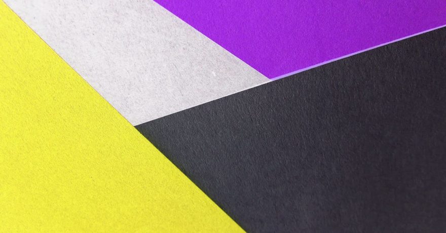
Color contrast refers to the difference in luminance or color that makes objects and text distinguishable from each other and their background. A high-contrast combination (such as black on white) makes content easier to read and scan, while low-contrast pairings (like light grey on white) are difficult to see, risking that key information is skipped or ignored. For digital banners, achieving sufficient contrast is vital for both legibility and accessibility.
Why Color Contrast Matters for Banner Offers
- Immediate scannability: Well-contrasted banners help users pick up the offer—such as a discount or CTA—in under two seconds, maximizing the impact of your campaign messaging.
- Accessibility compliance: Observing color contrast guidelines ensures your banners are readable by all users, including those with visual impairments, and helps meet WCAG accessibility standards.
- Consistent branding at scale: With tools like SizeIM, brands can preserve correct color contrast across dozens of formats, keeping every network and banner size both beautiful and high-performance.
Step-by-Step Framework: Designing High-Contrast Banner Offers
1. Start With the Offer Hierarchy
Identify the key elements on your banner: most likely the headline, offer details (like “40% OFF”), call-to-action button, and any supporting text. Assign a scanning priority. For most campaigns, the CTA and the headline require the highest contrast.
- Use bold, large font for the most important message.
- Secondary text (terms, extra info) can have slightly reduced contrast but should remain easily readable.
2. Select Brand Colors and Test Their Contrast
Gather your brand’s approved palette. Using a tool such as the WebAIM Contrast Checker, test the combinations of your core background and text/accent colors. For accessible banners, text should ideally meet a contrast ratio of 4.5:1 for body text and 3:1 for large/heading text, in line with WCAG AA guidelines.
- If your main color doesn’t provide enough contrast on your background, consider darkening one or lightening the other using your ad platform’s adjustment tools.
- SizeIM allows you to lock your brand color selections for easy reuse and consistent ratios across all resized banners.
3. Apply the 60/30/10 Color Rule
High-performing banners generally employ three colors: a dominant color (background, 60%), a secondary color (usually text or offer—30%), and an accent color for CTAs or highlights (10%). For instance, using navy blue as a background, white for headings, and bright orange for the buy button draws attention directly to the action point without visual clutter.
4. Create Clear Delineation for CTAs
The call-to-action button is vital. Make it pop by ensuring the button color and text stand in sharp contrast with each other and with the background. For example, a white “Shop Now” on a deep red button stands out against a neutral background.
- Testing combinations in SizeIM’s live editor allows you to preview real-time scannability and check accessibility in different sizes.
- Use the same principle across all banners, from large leaderboards to small mobile rectangles, ensuring the CTA always draws the eye.
5. Test Your Designs Across Formats
Once your master design is set, preview it across the various standard display ad sizes. Small changes in size can affect color proportion and balance, so automated tools like SizeIM are essential. They preserve your established contrast and layout logic, even when adapting designs to formats like 300×250, 728×90, or 320×50.
- Review banners at both 100% and reduced resolution to ensure offers remain scannable.
- Always check banners against both light and dark publisher site backgrounds for accidental blending.

Example of High-Contrast Banner Offer
Imagine a flash sale banner with a dark blue background, bright yellow headline text, and a bold orange CTA button. This configuration meets contrast standards, provides a logical reading order (headline → offer → CTA), and draws the eye directly to the action. When using SizeIM, this layout is adapted to every display format while maintaining its impactful color contrast.
Common Pitfalls to Avoid
- Do not use color combinations that blend together, such as red text on green backgrounds. These are hard to read for everyone and especially problematic for color-blind users.
- Avoid using too many bright colors. Reserve bold or neon shades for small highlights, not for backgrounds or supporting text.
- Neglecting to test contrast on actual ad placements can result in banners that look good in isolation but disappear on busy or similar-toned websites.
Best Practices for Banner Offer Color Contrast
- Design for clarity first; never sacrifice readability for style.
- Test every banner size—automating this with SizeIM is most efficient for agencies or anyone running multi-format campaigns.
- Involve your team in QA. Ask multiple people to scan the finished ad for 2 seconds: Can they immediately decipher the offer?
- Set up and save brand kits for consistency across network, region, and campaign touchpoints.
How SizeIM Makes Color Contrast Consistent at Scale
SizeIM is engineered to address one of the biggest pain points for marketing teams: maintaining correct contrast and brand consistency while exporting dozens of ad sizes in minutes. With features like:
- Centralized brand kit management for locked-in color palettes and compliant fonts
- Automated resizing that preserves all original contrast and design intent
- Live editor and template preview for real-time adjustment
- Support for major banner sizes used by all leading ad networks
This means you design your offer once and instantly benefit from standards-compliant, high-contrast banners everywhere you advertise, without repetitive manual tweaks or quality loss. For more on efficient workflow management in display ad creation, consider reading our guide to BannerSnack alternatives.
Frequently Asked Questions
What is the recommended contrast ratio for banner ad text?
For regular-sized text, aim for at least a 4.5:1 contrast ratio against the background. Large headlines or CTAs (18pt+ or bold 14pt+) can meet a minimum ratio of 3:1 according to accessibility guidelines. Using SizeIM, you can easily test and implement these standards across all your banners.
How do I test color combinations for accessibility?
Use online tools to check your chosen color pairs. Within SizeIM’s editor, real-time previews and the ability to lock your palette help maintain compliance without extra effort.
Why does my CTA button sometimes disappear on certain sites?
This typically happens when the banner’s background or button color matches the hosting page. Always preview banners against light and dark backgrounds and tweak as needed. SizeIM simplifies these previews and adjustments.
Can I maintain color contrast when resizing banners manually?
Manual resizing makes it difficult to keep contrast and layout logic perfectly in sync. Automated platforms such as SizeIM remove this burden by maintaining all settings as you generate multiple sizes. This saves you time and prevents costly errors.
Does using too many colors hurt banner performance?
Yes. Limit your core palette to 2-3 colors to avoid overwhelming users. Excessive contrast or clashing hues can reduce clarity and reduce trust. Focus on simplicity for the best results.
How can I ensure all banners stay brand consistent?
This is one of SizeIM’s primary strengths: once your brand kit (colors, fonts, logos) is set up, all exports use these standards for every banner, in every size. This guarantees both accessibility and brand integrity.
Conclusion
Mastering color contrast in banner offers is crucial for readability, accessibility, and performance. Define your color hierarchy for offer, text, and CTA; test and confirm all contrasts meet compliance standards; and always preview banners in every critical size and on diverse backgrounds. Tools like SizeIM make it simple to automate this process, freeing your creative team to focus on strategy and design quality, not repetitive production tasks. Ready to enhance the clarity and impact of every display ad you produce? Try SizeIM for free or explore our plans for agencies, enterprises, and creative teams—and join those already setting the standard for effective, high-performing banner offers.