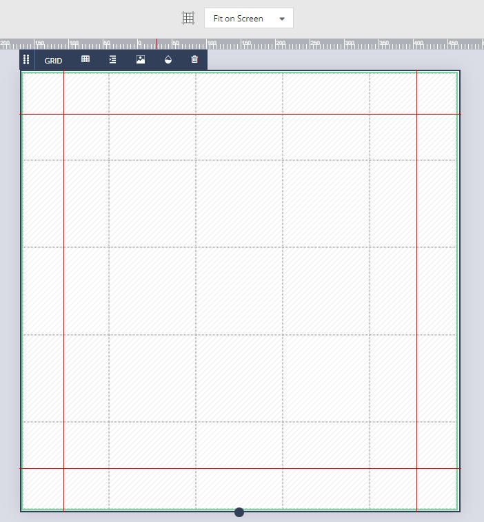
The first layout you see will be a default 300x300px square, divided into a grid of 5 rows and 5 columns, each of an equal size.
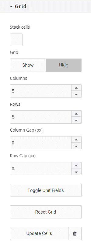
You can adjust the number of rows and columns, as well as the horizontal and vertical gaps between cells using the Grid properties panel on the right hand side of your screen. You can also adjust the width/height of each individual row or column by clicking on the ‘Toggle Unit Fields’ button. This will create a text field at the top of each column and the left of each row. The default value for each row width and column height is 1fr. The ‘fr’ unit is a fractional unit, and 1fr represents one part of the available space. If, for example, you were to change a column value to 2fr, it would become twice as wide as each of the other columns. The unit fields can also be entered in px, % or em values.
This square layout will also contain guides marking margins 30px from each edge.
While the grid element is primarily for setting out your content, it has properties like any other element, and so can have, for example, a border or a background image or color applied, which will be visible on your generated images.
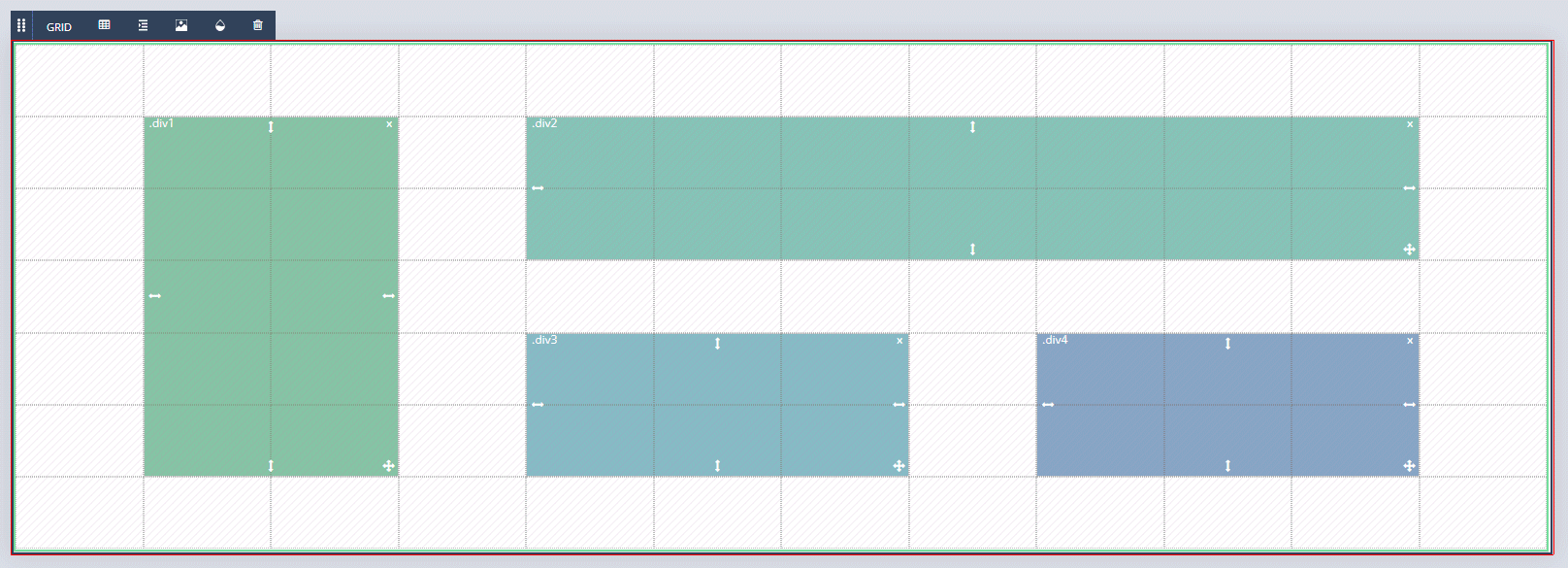
Once the grid is set up to your liking, you can begin to add content areas to your layout. These will eventually be converted to Cells, into which content can be placed. To add a content area, click and drag within the grid. Content areas will automatically snap to your grid lines in order to keep the elements that you add to your layout aligned. You can adjust content areas by clicking and dragging on the move and/or resize icons. You can delete content areas individually by clicking on the ‘x’ at the top right of each area. You can also delete all content areas to start again by clicking on the trash can icon under ‘Cells’ in the Grid properties panel. Content areas can, but don’t necessarily have to, overlap.
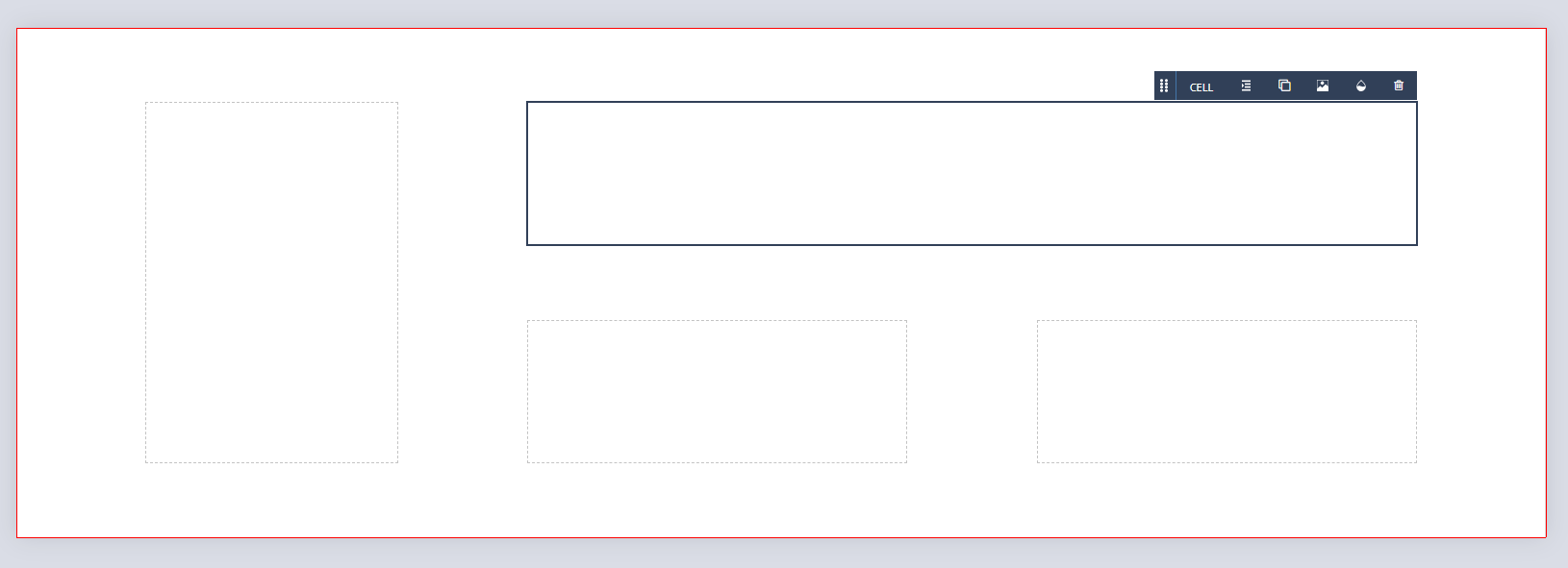
When you are happy with the size and placement of your content areas in this layout, click on ‘Update Cells’ in the Grid properties panel, or ‘Apply’ directly under the canvas. This will create a cell from each of the content areas in your layout, each represented by a dashed outline. Cells, by default, are assigned the Flex display property, and elements added to the cell will be arranged in a column with an equal amount of space between each element. This can be changed using the Alignment panel in the Properties Control Column.
You can add further cells by clicking on the grid icon and repeating the above process, should you need to.
When you’re happy with the content areas in your square, clicking the Create Formats button in the main SizeIM toolbar will create tower and banner formats based off the square and its content areas. These can be further adjusted to your liking, providing SizeIM with the information required to generate your actual Ad Sizes.