Once an Element is on the canvas, clicking on it will reveal a label displaying the Element type, as well as a series of icons, above the element. In addition to content elements, layout elements such as grids and cells can be selected by clicking on their labels.
Depending on the particular element, the label will contain different icons relating to that element’s properties. For example, in the case of the Image Element, the Label will contain the following:
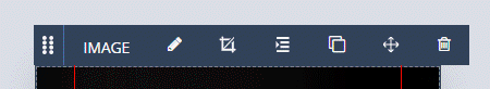
- Handle
Click and drag on this to reposition an element on the Canvas - Element Type
- Edit Link
Used to determine what image the Image Element should display
Indentation – Allows you to define margins and padding on the element (more on these later) - Crop Tool
Can be used to reframe the image - Indent
Allows easy access to the element’s padding and margin settings - Duplicate
Creates a copy of the Element - View Grid
Opens the project’s grid for editing - Trash Can
Deletes the Element
In addition, if a non-Image Element has had a background image applied, an image icon will be present on the label to allow quick access to the Element’s background properties.
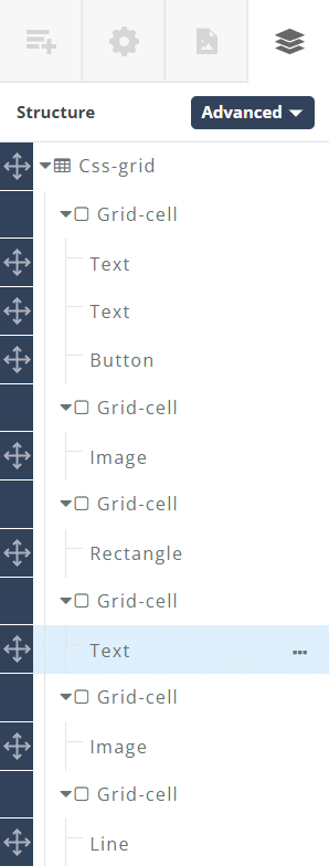
In the case of text-based elements, clicking on the element won’t reveal its tab. Tabs for Text, Heading or Quote elements are revealed by opening the Advanced Control Column to reveal the structure of the layout, and clicking on the Element in the tree structure.