Each element in an SizeIM project has a number of associated Properties. Some properties are universal across element types, with others applying only to certain elements.
Properties are accessed by selecting an element on the canvas, and then clicking on the Properties Control Column. If you open the Properties Control Column without having selected an element, it will prompt you to do so in order to begin making changes.
Once an Element is selected, it will remain highlighted on the Canvas, and a label indicating the element type will appear at the top of the Properties Control Column.
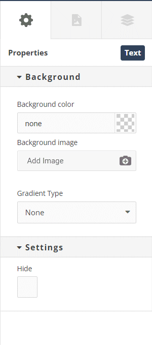
Properties are divided into groups so you can easily find those that you wish to edit. The following image shows the groups of Properties available when an Image Element has been selected on the Canvas.
Options present in the Properties Control Column differ depending on what type of element is selected on the Canvas, and are grouped into six categories. These groups are:
- General
- Background
- Alignment
- Settings
- Border
- Advanced
The properties typically contained within each section are as follows.
General
- Width/Height
Define the dimensions of your element. These can be set as %, px, vw or em.
Auto width will allow the element to fill whatever space is available to it.
Auto height will make the element take on the height of its contents. - Max height/Min height
Restrict your element’s to force it to fall between these two values. - Padding
Creates a space between the edge of an element and its content.
Separate values for left, top, right and bottom. Can be set as %, px, vw or em. - Margins
Add space around the outside of an element.
Separate values for left, top, right and bottom. Can be set as %, px, vw or em.
Background
- Background Color
Fill the background of an element with a single color. This color can supports transparency. This color can be selected using the built-in color picker, or by manually entering an rgb, rgba or hexadecimal value. - Background Image
Assign a graphical background to an element using the SizeIM Media Library. You can upload and select an image of your own, or select from a library of stock images.
Once an element has had a Background Image set, an extra icon will appear on that element’s label. Clicking on this icon will open the Background settings in the Properties Control Column.
Once a Background Image has been set, an additional set of controls become available, allowing you to manipulate how the Background Image is displayed. These are:
◦ Background Size
◦ Background Position x
◦ Background Position y
◦ Background Attachment
◦ Background Repeat - Gradient Type
Fill an element’s background with a gradient that blends smoothly between two colors. Gradients can be Linear or Radial. When a Gradient Type has been selected, additional options become available in order to select the colors, position and direction of the gradient. - Filter
By enabling the Filter controls, you can apply graphical effects to an element. When enabled, a series of sliders will appear, allowing you to adjust the blur, brightness, contrast, saturation and hue of the selected element and its contents. - Blend Mode
This can be used to achieve color effects on your element backgrounds by setting both a Background Image and a Background Color, and specifying how they should blend together.
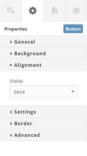
Alignment
- Display
Specifies whether an element is treated as a block or inline box or the layout used for its children (if any) – grid or flex. Options are:
◦ Block
◦ Inline
◦ Inline-block
◦ Flex
◦ Grid
Settings
- Hide
Checking this box will hide this element in the layout currently being edited.
Border
- Border Radius
Define a radius for the element’s corners. Can be set as % or px. - Border
Select a border width (in pixels or em), style and color. These are defined separately settings for each of the top, right, bottom and left borders.
Advanced
- Position
By default, elements are positioned statically. This means that they follow the flow of the page, each appearing after the previous. SizeIM does, however, offer three other options for positioning elements. These are:
◦ Relative
A relatively positioned element is positioned relative to what its normal static position would be. When relative positioning is selected for an element, the top/right/bottom/left values can be used to move the element away from its normal position. When an element is positioned relatively, other content does not adjust to fill the gap created by moving the element.
◦ Absolute
An absolutely positioned element is positioned relative to its’ nearest ancestor with a position other than ‘static’. If all ancestors have static positions, then an absolutely positioned element will be positioned relative to the page it is on.
When absolute positioning is selected for an element, the top/right/bottom/left values are used to indicate how far the edges of the element should be from the edges of the element is is being positioned within.
◦ Fixed
An element with a Fixed position will remain in the same place in the Experios Viewer, even when a page is scrolled. The top/right/bottom/left values can be used to position the element in the viewer. If these values are not assigned, the element will initially be positioned as if it was relatively positioned. - Position Values
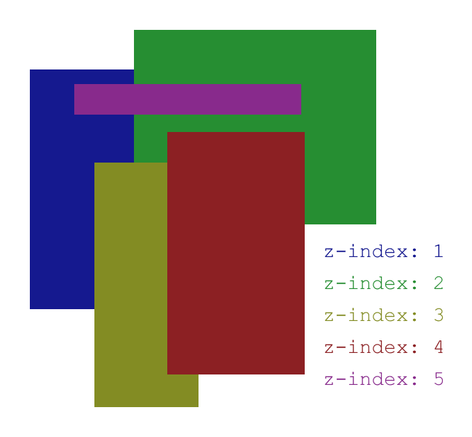
Used in conjunction with the Position property. The effect these have on an element are outlined in the section above. - Z-index
The z-index of an element defines how it stacks with other elements on the page along the z-axis (this can be thought of as an imaginary line between your screen and your eyes). Elements with a higher z-index value will appear in front of those with a lower value.
How z-index is used to affect stacking order - Opacity
Apply transparency to an element (and its child elements), by entering a percentage value here. 0% is fully transparent, 100% is fully opaque. - Fluid Properties
A set of values that can be assigned to an element to ensure they always remain between a minimum and maximum value. Multiple fluid properties can be active simultaneously.
Expert users have access to and can edit the full range of element properties. Standard users are more limited in their options as they are presented with a reduced list of properties.