
When display ad click-through rates stall, the call-to-action (CTA) button is often the root cause — not just a design afterthought. The CTA button holds the power to turn passive views into measurable results. If you’re finding that impressions are up but clicks remain static, targeted changes to your CTA strategy are the first and most impactful steps to revitalize campaign performance. Here at SizeIM, we’ve worked with agencies, designers, and marketers to overhaul CTA button effectiveness at scale, across every display network and ad size.
This guide breaks down exactly what to change (and why), with actionable next steps to ensure your display ad CTA buttons aren’t suppressing clicks. We’ll cover the core reasons why buttons underperform, the specific tweaks that drive engagement, and how to systematize CTA optimization — especially when adapting ads across multiple sizes and placements. Whether you’re a seasoned marketer or just starting out in digital advertising, optimizing CTA buttons can unlock measurable lifts in both clicks and conversions.
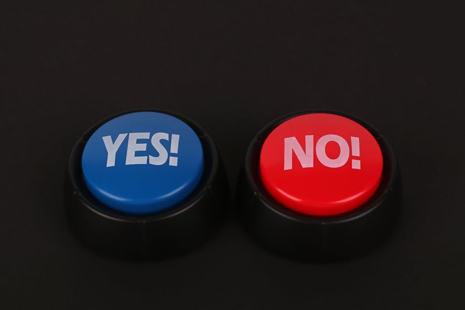
What is a CTA Button in Display Ads?
A CTA (call-to-action) button is a distinct, interactive element within a display ad that prompts users to take a desired next step — like “Start Free Trial” or “Download Guide.” In high-performing campaigns, the CTA button stands out visually, clearly communicates benefit or action, and leads directly to the intended destination or conversion path. The design, placement, and messaging of your CTA button can make or break the effectiveness of your entire campaign.
Why Do CTA Buttons Cause Clicks to Stall?
Clicks tend to stall when the CTA button fails in one or more of these critical areas:
- Insufficient visual contrast (the button blends in)
- Vague or generic button text
- Poor placement or eye-flow disruption
- Lack of interactive cues (does not look clickable)
- Crowding or lack of white space
- Disconnection between button text and landing page promise
- Absence of urgency or scarcity
- Size inconsistency across ad formats
- Too many competing actions (multiple CTAs)
- Lack of real A/B testing
Each of these issues chip away at the user’s willingness and ability to click, causing a drop in engagement and ultimately hurting campaign ROI. Let’s dive deep into each problem and show you what to change.
Revitalizing Stalled CTA Buttons: A Step-by-Step Framework
1. Establish Strong Visual Contrast
The button must jump out from the ad’s background. If your CTA’s color matches or is too similar to the header, background, or major graphic elements, it’s immediately overlooked. We recommend making use of a high-contrast color — one that appears nowhere else in the ad. For example, a bright orange button on a navy background, or a bold yellow on gray. Many businesses find that systematically testing color combinations (using A/B tests) surfaces clear winners for CTR.

2. Swap Out Vague for Specific Button Text
Generic CTAs like “Learn More” or “Click Here” drag down performance. When clicks stall, the most direct fix is to rewrite the button text to include both an action verb and a result. Instead of “Discover Solutions,” say “Get My Free Demo.”, “See Pricing Now,” or “Design My First Banner.” Clear, outcome-driven wording preempts confusion and increases motivation to click. Make a shortlist of specific alternatives and rotate them through different ads to uncover your top performer.
3. Reposition for Natural Eye Flow
Audiences instinctively scan left-to-right and top-to-bottom. Place your primary CTA at the bottom right or bottom center of your display ad, not floating mid-canvas or buried amongst copy. This natural position means the button is seen just as users finish processing your offer. On certain formats, bottom center may stand out best, but test both placements for your campaign’s best results.
4. Enhance Clickability with Visual Cues
Make it obvious the button is meant to be pressed. Add depth with borders, shadowing, or dimension; add an arrow or icon to suggest movement. Ensure sufficient padding so the button doesn’t become crowded, and add hover states for desktop users to reinforce interactivity. Your button should attract the impulse to click — especially on mobile, where finger-tap usability is essential.
5. Maximize White Space
Don’t crowd your button with too much text or graphics. White space acts as a spotlight — use at least 10-15 pixels of space around the button, keeping nearby imagery or additional CTAs to a minimum. This visual breathing room is even more critical for smaller ad sizes and mobile formats, ensuring the button is both tappable and unmistakable.
6. Align Button Message with the Landing Page
A common cause of stalling clicks is a disconnect between the button promise and post-click experience. If you promise “Get 5 Free Templates,” the landing page should immediately deliver or reference those templates. Misalignment breaks trust and kills conversion. Audit every ad-to-landing experience and update one or the other for a seamless user journey.
7. Add Urgency or Scarcity
Flat, non-urgent CTAs (“Read More”, “Explore”) create no incentive to act now. Time-sensitive or exclusive language (“Start Free Today”, “Limited Spots Left”, “Claim My Offer”) creates mild FOMO and boosts clicks. Only include urgency where truthful — and rotate new copy in regularly to keep the message fresh for repeat viewers.
8. Match Button Size to Ad Format
The perfect button in a 300×250 ad is likely too big or too small for a 728×90 leaderboard or 320×50 mobile banner. Make sure button size is visually prominent but not overwhelming, and always easily tappable on mobile. Platforms like SizeIM handle this automatically, scaling your optimized button design across all required display sizes so your CTA remains effective on every network and device.
9. Limit to One Primary CTA
Adding multiple competing CTAs in the same ad creates indecision. Prioritize a single action per ad, styling one button as the clear focus. If you must offer a secondary action (such as a video demo and a product trial), subordinate its visual emphasis. Most campaigns find highest engagement with a clear, singular CTA.
10. Commit to A/B Testing Regularly
Frequent, deliberate A/B testing of button color, placement, size, and wording underpins the highest performing display ad campaigns. Test one variable at a time and track click-through rates across each ad format. Document and systematize your findings so improvements are scalable across future campaigns, not lost to memory. This is particularly important if your agency handles multiple brand campaigns or runs seasonal creative updates.
Best Practices for Display Ad CTA Buttons
- Use colors entirely unique from the rest of the ad — high-contrast is non-negotiable
- Write button copy that offers a clear value and outcome
- Audit all existing ads regularly for clutter, crowding, and misplaced CTAs
- Maintain at least 10 pixels of space around the button for clarity
- Align landing experiences word-for-word with the button’s promise
- Test, document, and revisit winning CTA elements quarterly
For more on modern display ad design and review workflows, read our guide: What software makes display ad approvals easier when clients only want to review one core design before all sizes are generated?
Optimizing Across All Banner Sizes: Why SizeIM Accelerates Results
Every display network has its own required dimensions, file sizes, and standards — making multi-size adaptation a huge workflow bottleneck for agencies and designers. With SizeIM, you design one banner, one button, and we instantly resize it to suit every format (from leaderboards to mobile). Not only does this save significant time, it ensures that every insight you gain from button A/B tests or copy improvements is immediately reflected across your campaign’s entire banner suite. Consistency is critical, especially for brand recognition and maximizing ROI.
Our platform supports agency teams, enterprises, and small teams seeking a responsive approach to display ad production. If you’re tired of fixing the same CTA or headline in 20+ different sizes, discover how SizeIM automates the process so you can focus on testing, creativity, and true campaign optimization. Explore our recommended multi-size workflow strategies for creative teams.
Quick CTA Button Audit Checklist
- Is your button color contrasting strongly with the background?
- Does the copy promise a clear, specific action or benefit?
- Is the button located in the bottom right or another area of natural eye flow?
- Does it look visibly distinct and interactive (not flat, not text-only)?
- Is enough whitespace provided to make the button stand out?
- Are you using only one primary CTA per ad?
- Is your button’s message consistently echoed by your landing page?
- Have you A/B tested button variables within the last 30 days?
- Is the button sized appropriately for every ad format in production?
- Is urgency or exclusivity being used (authentically) where possible?
Implementing a CTA Button Overhaul
To avoid overwhelming your team, tackle improvements in phases:
- Step 1: Audit every current ad for problem areas using the checklist above.
- Step 2: Prioritize fixes — start with contrast, copy, and placement, as these usually yield the biggest wins.
- Step 3: Test updated ads in parallel with old ones to get real attribution data.
- Step 4: Once wins are clear, roll the changes out across all ad sizes (using an automated resizing tool like SizeIM to save hours per campaign).
- Step 5: Build a habit of ongoing CTA testing into your regular workflow.
Measuring the Impact
Track these metrics to evaluate your CTA button improvements:
- Click-Through Rate (CTR): Your leading indicator of improvement.
- Cost Per Click (CPC): Should decrease as CTR rises.
- Conversion Rate: Watch for landing page drop-off after button changes; consistency here matters.
- Cost Per Conversion: Lower costs means greater return.
Make a point to measure before and after, so you know which change mattered most.
FAQ: Display Ad CTA Buttons and Stalled Clicks
What’s the first thing to change when my display ad clicks slow down?
Start by increasing the visual contrast of your CTA button and rewriting the copy for specificity. These often yield the fastest click improvements.
How do I know if my button is too small or too large for certain ad sizes?
Compare the button size as a proportion of overall ad dimensions for each format. If resizing manually is slowing you down or creating inconsistencies, leverage a platform like SizeIM to automatically resize and standardize buttons across every ad.
Why does matching landing page copy matter so much?
If your button promises something (such as a free template, discount, or demo), the landing page must deliver on it immediately. Any mismatch erodes trust and increases bounce rates, negating the benefit of increased clicks.
Should I use more than one CTA button in a display ad?
Only if there are two distinct and equally important user paths. In most cases, sticking with a single, visually dominant CTA per ad performs best and minimizes confusion.
How often should I A/B test CTA button elements?
Ideally, test one variable (color, copy, or placement) per campaign iteration, revisiting at least every month for ongoing optimization.
How can I save time updating CTA buttons across many ad sizes?
Use a responsive ad design platform like SizeIM to update your button design or copy once and instantly generate all required variations. This is especially powerful for agencies or teams running multi-brand or multi-language campaigns.
Is there a standard list of CTA words that work best?
No universal list exists, but phrases that provide both an action and an outcome (“Start Free Trial”, “Get Instant Access”, “See Templates Now”) consistently perform better than generic alternatives. Test based on your audience and offer.
Conclusion
Optimizing CTA buttons is one of the fastest ways to break through stalled display ad performance, unlocking higher click-through and conversion rates with focused, testable changes. Prioritize contrast, specificity, message alignment, and consistent scaling across ad sizes. Whether you handle one brand or dozens, integrating a platform like SizeIM ensures CTA improvements instantly propagate to every display ad, saving valuable hours and preserving brand consistency.
Ready to elevate your ad results and workflow? Discover how SizeIM can streamline your multi-size ad production and empower your team to focus entirely on what drives results. Try it today — and turn every stalled button into a high-converting engine for your campaigns.