Memorial Day banner ads must walk a careful line. Brands need to communicate time-sensitive offers and drive campaign outcomes, but these ads exist in a context that requires respect, simplicity, and thoughtful design. To maximize clicks while honoring the day’s significance, effective Memorial Day banners blend urgency with a clean, minimal layout and mindful messaging. The most successful campaigns prioritize legibility and balance, not sensationalism. Below, you’ll find a step-by-step, expert-backed process, with insights from SizeIM, for getting that blend right and creating banners that scale across every required display size.
What Makes Memorial Day Banner Ads Different?
Memorial Day is more than a retail moment—it is first a day of remembrance. Ads using overly bright designs, aggressive animations, or party-centric copy risk missing the mood and actually reducing engagement or trust. Instead, high-performing banners for this holiday honor military service and national values, using respectful, carefully-crafted visual cues. The advice below—rooted in best practices and real display campaigns—offers a framework that ensures urgency never comes at the expense of clean, credible design.
Memorial Day Banner Ads: Key Principles
- Recognize the significance of the holiday. Tribute messaging should be present and distinct.
- Favor minimalism: Clean layouts, lots of whitespace, and unambiguous calls to action.
- Let urgency show through concise copy, bold type, and color accents, not chaos or clutter.
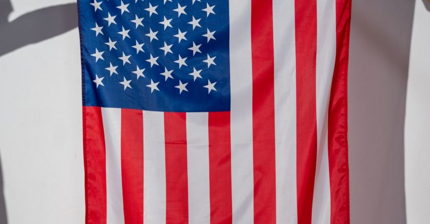
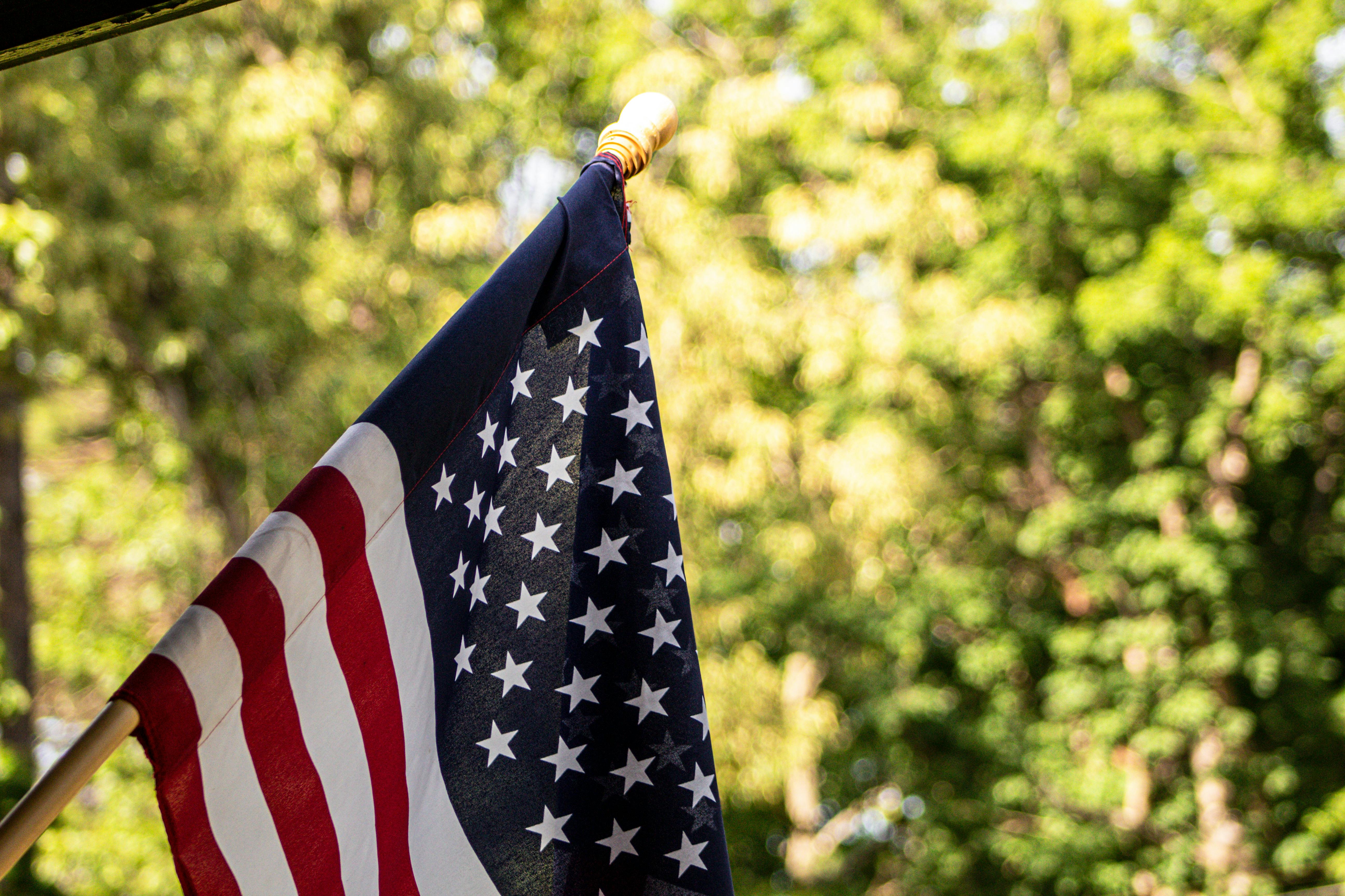
- Respect flag etiquette and national symbols—never use them as mere decorative backgrounds for pricing or discount copy.
- Harness automation platforms like SizeIM to keep consistency and design standards high across every banner size.
Definition: Clean vs. Urgent Memorial Day Ad Design
Clean design prioritizes readability, open space, and clear hierarchy of information. Urgent design, meanwhile, highlights time-limited value and prompts immediate action. Striking a balance for Memorial Day means deploying urgency within structures that remain tasteful and easily scannable—never overwrought or garish. Many creative teams achieve this by using two message layers (tribute and offer), disciplined color choices, and automated resizing to maintain equilibrium across formats.
Strategic Framework: Step-by-Step Production for Memorial Day Banner Ads
1. Clarify Banner Purpose
- Is this placement primary for sales, site navigation, tribute, or lead gen? Each goal warrants distinct copy and urgency levels.
- Memorial Day tributes should never be overshadowed by the promotional offer. Define your hierarchy early.
2. Two-Layer Messaging Architecture
- Layer 1: Tribute (short phrase that directly acknowledges the holiday, such as “In Honor of Our Heroes” or “Remember and Honor”).
- Layer 2: Promotional Offer (concise, single headline—avoid list promos; use “Memorial Day Sale: Up to 25% Off” instead of multiple offers).
- Accompany with a focused supporting detail (dates, key terms) and a single, high-contrast CTA (“Shop Deals” or “Get Offer”).
3. Select Colors That Embody Respect and Action
- Base your palette on navy or deep blue (gravitas and clear contrast).
- Limit red to accents (CTAs or small dividers), not backgrounds or text blocks.
- Abundant white space keeps everything legible and calm.
4. Build a Clean Layout Structure for Every Size
- Restrict banners to four main sections: headline/tribute, offer, date or detail, and CTA.
- Horizontal units: left (tribute), center (offer), right (CTA and logo). Vertical units: top (tribute), middle (offer), bottom (CTA+logo).
- Review each size; if copy crowds a mobile leaderboard, trim until it’s glance-readable.
5. Typography as Functional Urgency
- Large, bold sans serif typefaces for headlines maximize immediate recognition.
- Complement with a secondary font for details. Avoid overuse of styles, italics, or decorative scripts.
- Dark-on-light or light-on-dark for accessibility; ADA compliance is a key design check for banner text, especially across varied sizes.
6. Use Imagery Judiciously
- Integrate subtle patriotic visuals: faint flag overlays, star or wreath motifs, or silhouettes (examples: a folded flag, a salute shadow). No festive or party decor.
- Brand visuals and product shots should serve as context—never overpower tributes or the headline.
- Respectful use of national symbols protects brand trust with a wide audience.

7. CTA Strategy
- Use a single, visible CTA button per unit; avoid fragmenting attention.
- Highlight with disciplined use of red or white for buttons, placed near the center or lower third.
- If using animation, keep it minimal—a slight CTA pulse or fade is appropriate, but avoid aggressive movement.
Real-World Application: Building Instant Multi-Size Memorial Day Ads With SizeIM
With SizeIM, teams design a single, clean Memorial Day master concept—using the above framework—then instantly generate every required banner size for their display networks. This includes key formats like:
- 300 x 250 Inline Rectangle
- 728 x 90 Leaderboard
- 320 x 50 Mobile Leaderboard
- 300 x 600 Half Page
- 970 x 250 Billboard
Uniform color systems, typography, and honoring elements (such as a tribute line or respectful flag accent) are preserved in each export. This eliminates manual resizing work, prevents errors from ad size adaptation, and allows designers to accommodate urgent feedback without rebuilding every file. Automated resizing through SizeIM means quick scaling without sacrificing quality, especially when time-to-campaign is tight.
Best Practices for Memorial Day Banner Ad Production
- Audit every size: After automation, individually check micro-formats for legibility and design integrity before launch.
- Centralize brand assets: Templates and brand kit management safeguard visual consistency at volume, a foundational capability of SizeIM’s platform.
- Get early stakeholder input: Review tribute versus offer balance and secure sign-off to avoid rework on multiple sizes.
- Monitor accessibility: All banners must remain accessible and readable—test color contrast and font sizes on small units.
- Use internal QA checklists: Cross-reference file outputs for date, CTA, and tribute accuracy on deliverables to multiple ad networks.
Production Workflow: Memorial Day Banner Campaign With SizeIM
- Strategy and Messaging
- Decide on the tribute/offer split for each creative and copy stack.
- Brief designers with a clear master message.
- Master Design
- Build core layout using navy/blue base, bold white copy, red accent for CTA.
- Add tribute text and a subtle, respectful visual (flag, silhouette).
- Automated Resizing
- Specify all needed display formats; let SizeIM reflow the design for each one, maintaining the correct hierarchy and spacing.
- Fine Tuning and QA
- Edit supporting text for constrained spaces.
- Confirm CTA clarity, contrast, and color in each exported asset.
- Export and Deliver
- Export everything to preferred ad hosting or trafficking formats.
- Organize by size and campaign for smooth deployment.
Frequently Asked Questions
What is the best way to acknowledge Memorial Day in a banner ad without losing sales momentum?
Use a concise tribute phrase as the top line or visually placed intro, then shift to the offer as the main headline. Let bold type and an accented CTA supply urgency, while colors and layout honor the day.
How do I make sure my banners are respectful but still convert?
Keep all copy concise, avoid party-themed language, and limit design elements to clean lines, disciplined color, and one impactful image or visual reference to Memorial Day.
How does SizeIM help with multi-size Memorial Day campaigns?
SizeIM allows you to design one master concept (with your tribute and urgent messaging), then automatically generates every display size you need. Brand kits and templates lock in consistency, and every ad output can be reviewed for compliance and clarity in minutes. This approach saves hours of manual resizing and quality assurance work, letting you roll out large campaigns quickly without sacrificing quality.
What are common pitfalls to avoid for Memorial Day ads?
Overusing red or excessive graphics, squeezing too much copy into small formats, and placing promotional copy directly on flag imagery are typical mistakes. Favor a minimal, respectful approach for better engagement and brand integrity.
Further Reading and Resources
- For more on automating multi-size banner production, see Mother’s Day Display Ads: Design Ideas That Still Feel Premium at Small Sizes.
- Learn about efficient campaign turnaround in What software can replace hand-coded HTML5 banner templates when an agency needs faster campaign turnaround?.
Conclusion: Respect, Clarity, and Scale
Producing Memorial Day banners that respect the holiday while driving action is a matter of design discipline and workflow strategy. Start by defining your purpose for each placement. Structure tributes and offers as distinct message layers. Embrace minimalism and ensure clarity through smart layouts, reliable typography, and disciplined use of color. And to work at scale, platforms like SizeIM help you deliver clean, on-brand ads in every size—fast. The result is a campaign that honors both your brand’s goals and the meaning of Memorial Day.