
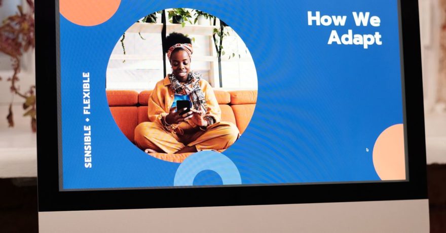
Stretching HTML banners to fit a wide array of display sizes—without distorting design or sacrificing brand consistency—is a challenge faced by designers, agencies, and marketers alike. The need to deliver dozens of creative variants quickly is only growing, especially for teams managing multiple brands or networks. Yet, stretched or incorrectly resized banners often lead to broken layouts, unreadable text, or off-brand results. In this comprehensive guide, we explain proven strategies to stretch HTML banners smartly. We walk through hands-on HTML/CSS patterns and why using a responsive design automation platform like SizeIM is considered best practice for scalable, consistent, and efficient banner campaigns.
What Does It Mean to Stretch an HTML Banner?
“Stretching” a banner refers to adapting a single creative concept to fill many differently shaped ad slots—horizontal leaderboards, tall skyscrapers, mobile rectangles, and more. The process should preserve readability, brand integrity, and user experience regardless of dimensions. If not managed carefully, stretching leads to visible design breaks, such as:
- Distorted images and logos
- Text overflow or excessive truncation
- Misaligned CTAs or cropped elements
- Loss of overall visual hierarchy
For modern banner campaigns, maintaining a robust multi-size creative system is essential. SizeIM addresses this by generating consistent ad sets for every required format from a single core design.
Why Stretching Commonly Breaks Banner Design
Traditional design workflows often rely on exporting separate artworks for each size. When you try to stretch one fixed layout into a new ratio or resolution (for example, from 970×250 to 300×600), the following problems are common:
- Fixed pixel positioning: Does not reflow with container size, making content misalign.
- Image squashing: Visuals get compressed or cut off, especially if not using aspect-ratio-aware styling.
- Poorly scaling type: Fixed font sizes look too small or large on unusual placements.
- Overflowing blocks: Elements push beyond the visible area or stack out of order.
Responsive HTML banners require a different mindset, where layouts use flexible containers, adaptive images, and media queries—much like a web page designed for multiple devices.
Core Principles to Stretch Without Breaking
- Fluid Containers: Rely on
width: 100%andheight: 100%rather than fixed pixel values. This ensures the design adapts to any slot size. - Object-fit Images & Backgrounds: Use
object-fitfor inline images andbackground-sizefor backgrounds, so visuals fill their areas without distortion. - Flexible Layouts: Build primary structures with CSS Flexbox or Grid so content can rearrange between horizontal, square, and vertical aspects.
- Scalable Typography: Use rem, em, and viewport units, then adjust at key breakpoints with media queries.
- Respect Ad Network Specs: Know size, file weight, and animation limits for each target channel. Keeping code and assets lean avoids QA issues.
These approaches lay the groundwork for “stretch-friendly” designs and are fundamental to how SizeIM templates work.
Step-by-Step Framework for Building Stretchable HTML Banners
1. Treat the Banner as a Responsive Mini Webpage
Start with a flexible outer structure that adapts to any container dimensions without using absolute positioning:
<div class="banner">
  <div class="banner-bg"></div>
  <div class="banner-content">...</div>
</div>
.banner {
  position: relative;
  width: 100%;
  height: 100%;
  overflow: hidden;
  display: flex;
  align-items: center;
  justify-content: center;
  box-sizing: border-box;
}
This approach enables a single HTML/CSS package to be reused across 300×250, 320×50, or 970×250 placements. SizeIM leverages similar CSS base patterns in its exportable banners.
2. Stretch Images and Backgrounds the Right Way
For inline images, use object-fit: cover for hero visuals (so they fill, but crop at edges), and object-fit: contain for logos that must remain entirely visible:
.hero-image {
  width: 100%; height: 100%; object-fit: cover;
}
.logo {
  max-width: 30%; height: auto; object-fit: contain;
}
For background images used behind all other content, background-size: cover fills the area, while contain ensures the whole image is visible even if letterboxed. The right choice depends on which part of the image is critical to preserve.
3. Build Flexible Layouts for Variable Aspect Ratios
For multi-size sets, switch layouts at breakpoints that match banner orientation. For instance, use Flexbox row layout for leaderboards and columns for skyscrapers:
.banner-content {
  display: flex;
  flex-direction: row;
}
@media (min-aspect-ratio: 1/2) {
  .banner-content { flex-direction: column; }
}
CSS Grid is especially helpful when you need precise overlaying of backgrounds, text blocks, and buttons. See our deep dive on responsive HTML5 banner code for more pattern ideas.
4. Scale Typography for Both Tiny and Large Placements
- Use rem, em, or viewport-width units for font sizes.
- Limit line lengths via
max-widthto avoid awkward headline breaks. - Hide or shrink subcopy on very small banners using media queries.
.headline { font-size: 1.4rem; max-width: 80%; }
@media (max-width: 360px), (max-height: 70px) {
  .headline { font-size: 3.2vw; }
  .subcopy { display: none; }
}
By scaling text with breakpoints, you ensure both 300×250 rectangles and 970×250 billboards remain readable and professional.
5. Prevent Content Overflow and Cropping
- Apply
max-width: 100%to images and blocks. - Allow text and objects to wrap instead of overflow or truncate.
- Simplify banners on extremely small slots by hiding non-essential elements.
.banner-content { max-width: 100%; }
img, .logo, .hero-image { max-width: 100%; height: auto; display: block; }
.headline { word-wrap: break-word; }
Simplifying layouts at the smallest breakpoint ensures your message and brand are always legible.
6. Optimize for Performance and Ad Specs
- Compress images using WebP or similar formats; prefer SVG for logos.
- Minify your HTML, CSS, and JavaScript. Reduce animation complexity.
- Keep HTML5 banner exports under 120–150KB, as tighter file limits are standard across networks.
SizeIM automates file optimization and ensures output weights remain within guidelines, so you can run assets on every major platform without manual rework. For further tips, see our guide on display ad file size reduction.
7. Rigorously Test on Real Placements and Devices
- Preview banners in actual ad slots and across device emulators.
- Check image aspect ratios, font scaling, and whether CTAs remain visible.
- Refine media queries where layouts look crowded or empty.
Browser differences mean even well-coded layouts can break in some environments. Using a tool that standardizes rendering, like SizeIM, reduces surprises in production.
Where SizeIM Excels: Consistent Scaling, Brand Kits, and Workflow Control
Manual workflows for 10–25 banner sizes per campaign quickly become unmanageable. SizeIM is built for this reality, letting you:
- Design once and export all standard ad sizes automatically
- Apply brand kits universally (logos, fonts, colors are consistent everywhere)
- Leverage professional templates already optimized for stretching and multi-size reliability
- Grant access to team members for collaborative edits and feedback, streamlining workflow for both small teams and agencies running complex campaigns
The integration of responsive layout logic and brand kit management means you spend less time fixing ratios and more time refining creative that moves the needle.
Best Practices for Stretchable HTML Banner Production
- Define All Required Sizes Before Production: Start with your full placement map (rectangles, leaderboards, skyscrapers, mobile formats).
- Design a Master Flexible Layout: Use HTML/CSS with Flexbox or Grid, avoiding fixed pixel-based stacking.
- Set Media Queries For Extremes: Tweak layout, font sizes, and image visibility for very large and very small ad slots.
- Optimize All Assets: SVG for icons/logos, compressed images, minimal and reusable code.
- Test Early and Often: Use container emulation and live ad slot previews before signoff.
- Leverage Automation: Employ a platform like SizeIM to instantly scale your design system across every network spec without error-prone manual exports.
For more on workflow improvement, see our internal resource on catching display ad size and layout problems before handoff.
Reusable Responsive Banner Starter Pattern
This simplified pattern can be adapted for most multi-size campaigns:
<div class="banner">
  <div class="banner-bg"></div>
  <div class="banner-content">
    <img src="logo.svg" class="logo" alt="Logo" />
    <h1 class="headline">Responsive Banners Made Simple</h1>
    <p class="subcopy">Fits every display size automatically</p>
    <a class="cta" href="#">See how</a>
  </div>
</div>
Accompany this with CSS using Grid or Flex layouts, object-fit, responsive font sizing, and breakpoints for ultra-small and ultra-large formats as illustrated above.
Action Checklist for Your Next Banner Stretching Project
- List all display ad sizes required—include network oddities and mobile versions.
- Build one HTML master layout using grid or flex, not absolute pixel stacking.
- Prepare object-fit images and background graphics for aspect-ratio resilience.
- Implement font scaling and hide non-essential elements on tiny placements.
- Run optimization for images, asset delivery, and code minification.
- Test across emulated and real device slots; fix any overflows or cutoffs.
- For campaigns that must repeat at scale, deploy a multi-size automation platform like SizeIM.
FAQ: Stretching HTML Banners
What is the fastest way to create compliant multi-size banners?
Automated design platforms such as SizeIM allow designers to create one core layout and instantly generate every required size, with responsive logic already in place. Manual approaches tend to introduce more design inconsistencies and require extra time per size.
How do I avoid image and logo distortion?
Apply object-fit: contain on logos and critical brand marks, and object-fit: cover or background-size: cover for hero images that can crop at the edges. Always test on all required banner shapes before export.
Are there risks with text scaling for banners?
Yes—if you use fixed pixel font sizes, your copy may be unreadable or overflow on unusual banner dimensions. Use rem/em or viewport units and adjust with media queries for best results, and consider removing subcopy for the smallest slots.
What about file size and load times?
File size matters for ad network approval and user experience. Keep HTML5 banners under 120–150KB, use SVG for brand imagery, compress bitmaps, and minimize code. SizeIM does this optimization automatically in its export process.
Where can I find more example patterns for responsive HTML ad design?
See our guide to responsive HTML5 starter code and examples of successful cross-aspect layout patterns for more reusable templates.
Conclusion
Stretching HTML banners effectively is both a creative and technical discipline. It demands flexible layouts, adaptive images, scalable typography, and vigilant testing. Relying on manual resizing slows teams down and increases the risk of layout breaks, lost time, and brand inconsistency. A purpose-built solution like SizeIM brings much-needed automation, precision, and workflow control to the process—freeing designers and agencies to focus on creative impact instead of tedious exports.
If you are ready to simplify and accelerate your own multi-size display ad production, learn more about how SizeIM can help you get pixel-perfect results at scale.